This is the multi-page printable view of this section.
Click here to print.
Return to the regular view of this page.
The Hedgematic Portfolio
The theory behind the Hedgematic Portfolio
Hedgematic includes a collection of interactive tools to help explore the concepts behind the Hedgematic Portfolio. Visiting in order,
you are guided from historical background, through creation of a single hedged position, to the complete portfolio with hedged payouts for each year of retirement.
1 - TRCAPE vs. Future S&P Returns
Is past performance any guide to future stock market returns?
Is past performance any guide to future stock market returns? Efficient market theorists say “no,” but their claims are not universally supported.
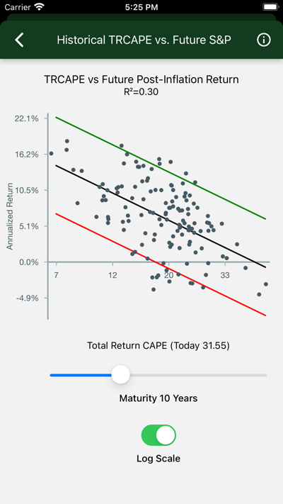
Robert J. Shiller, the Nobel Prize winning economist, explored this question in 1997, using data you see in this chart.
Data
Each dot on the chart represents a stock purchase made in one year.
-
TRCAPE appears on the x-axis. Computed from ten years of prior Standard and Poors 500 data, it is the ten-yaar average of individual Price/Return
ratios, where Price is the inflation adjusted value of the S&P index, and Return is the annualized total real past ten-year return, including reinvested
dividends, on the S&P investment. Consider it like a P/E ratio, smoothed over 10 years, and accounting for stock buybacks as well as just earnings. TRCAPE is historically high lately, suggesting that stocks are overvalued. Consult the background material below for how this statistic was
developed and named.
-
Annualized Real S&P Return appears on the y-axis. This is the annualized total real return of an S&P investment, including
reinvested dividends, over a given Term. It is essentially the sum of the end-of-term price and the compounded reinvested dividends, divided by the original purchase price, transformed into an annualized rate.
-
Term appears in the slider at the bottom of the page. This is the number of years the investment is held. It goes into the computation of data
points and the annualized return. As the term increases, returns draw closer to the historical rate of around six percent after inflation.
-
The black line is the best fit. Error bars capture about 95% of the data points. On the logarithmic scale the R-squared statistic is shown. This is
interpreted as the percentage of variation accounted for by TRCAPE. An R-squared of zero would appear with a horizontal line, indicating
no effect; if R-Squared were 1.0, we would see a perfect fit, with all the dots on the black line.
Interpretation
- With the Term slider in the middle, note that:
- With low values of TRCAPE, returns are high, indicating undervalued stocks.
- With high TRCAPE values, returns drop, indicating overvalued stocks.
- Move the slider to the left. Note that:
- TRCAPE is of little use predicting short-term returns. R-squared (on the logarithmic scale view) is minimal.
- Move the slider to the right. Note that:
- Returns cluster more closely around their predicted values as term increases.
- R-squared initially goes up as the effect of short-term volatility is absorbed and that of TRCAPE is revealed.
- R-squared drops in the out-years, as returns converge on their long-time performance. Even so, the quality of the prediction, measured by the
spread of the error bars, continues to increase.
Background
Shiller’s analysis is encapsulated in Valuation Ratios and the Long-Run Stock Market Outlook.
Shiller and his co-author, John Campbell, presented his findings to the Federal Reserve Board of Governers December 3, 1996.
In Shillers presentation, he described a statistic he called the “cyclically adjusted price-to-earnings ratio”, abbreviated “CAPE”, “CAPE10”, or “Shiller P/E”. This statistic is computed as the average P/R is described here, except that earnings appear in the denominator instead of total return. This statistic is available daily on financial sites.
As corporations incorporated stock buybacks into their strategies, investors sought a measure that incorporated total return. Shiller responded in 2018
by publishing a “total return CAPE”, or TRCAPE, the measure Hedgematic uses.
Shillers’ publicly accessible papers are linked at Home Page of Robert J. Shiller.
The data displayed on this page is sourced from U.S. Stock Markets 1871-Present and CAPE Ratio.
2 - TRCAPE and Reinvested S&P Earnings
What does past data suggest about the relationship between TRCAPE and expected future S&P returns?
What do we see if we model TRCAPE’s effect on future on future reinvested inflation-adjusted S&P returns?
Data
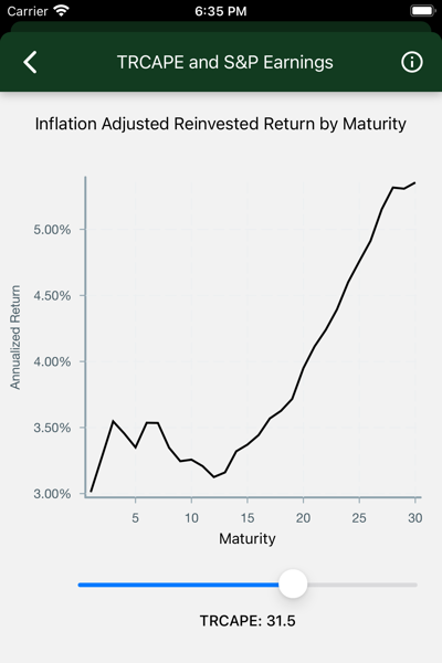
Each point on the black line represents the expected annualized real S&P return on a purchase held for a given term. The slider updates the chart for different values of TRCAPE at purchase time.
-
Maturity appears on the x-axis. This is the number of years an S&P investment is held. As the term increases, returns draw closer to the historical
rate of around six percent after inflation.
-
Annualized Real S&P Return appears on the y-axis. This is the expected annualized total after-inflation return of an S&P investment, including
reinvested dividends, given a Term and TRCAPE.
-
TRCAPE is adjusted with the slider.
Interpretation
- The chart is initially displayed for today’s TRCAPE.
- If you bought the S&P today and held it for a particular term, look on the y-axis to find your expected annualized return.
- Move the slider to the left to explore the historical effect of low TRCAPE values.
- In the short term, returns are higher than long-term values. Long returns approach historical long-term results.
- Move the slider to the right to explore the historical effect of high TRCAPE values (like recent ones).
- Returns are low for the first few years. These returns come mostly from dividends, comparatively unaffected by TRCAPE.
Background
In his paper Valuation Ratios and the Long-Run Stock Market Outlook, Shiller shows that
dividends are less sensitive to valuations than earnings.
The data displayed on this page is modeled based on data sourced from U.S. Stock Markets 1871-Present and CAPE Ratio.
3 - TRCAPE and S&P Price
What does past data suggest about the relationship between TRCAPE and expected future inflation-adjusted S&P prices?
What do we see if we model TRCAPE’s effect on future inflation-adjusted S&P prices?
Data
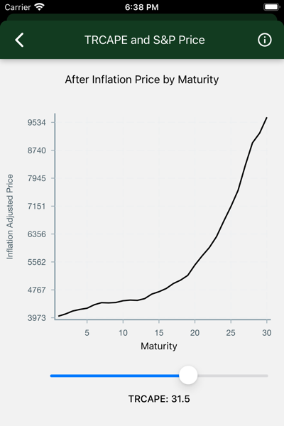
Each point on the black line represents the expected real S&P price at the conclusion of that term. The slider updates the chart for different values of TRCAPE at purchase time.
-
Maturity appears on the x-axis. This is the number of years an S&P investment is held.
-
Real S&P Price appears on the y-axis. This is the expected todays-dollar value of the S&P index, given a Term and TRCAPE.
-
TRCAPE is adjusted with the slider.
Interpretation
- The chart is initially displayed for today’s TRCAPE.
- If you bought the S&P today and held it for a particular term, look on the y-axis to find your expected inflation-adjusted S&P index at the end of your term.
- Move the slider to the left to explore the historical effect of low TRCAPE values.
- In the short term, low values of TRCAPE historically are associated with a steady increase in the S&P index.
- Move the slider to the right to explore the historical effect of high TRCAPE values (like recent ones).
- The index is flat for the first few years, indicating an S&P that just keeps up with inflation.
Background
The data displayed on this page is modeled based on data sourced from U.S. Stock Markets 1871-Present and CAPE Ratio.
4 - S&P Earnings Volatility
The stock market offers attractive average and long-term returns. But what about volatility?
What if we show confidence intervals around modeled S&P Returns?
Data
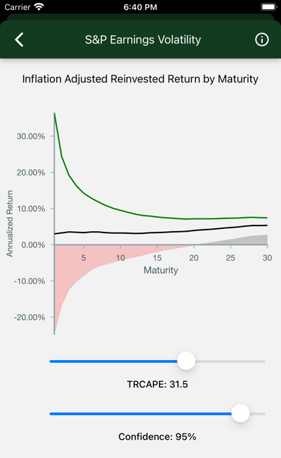
The chart shows real annualized return by term, given TRCAPE. A slider allows you to set a percentage, called “confidence”.
If confidence is 95%, the high and low lines are drawn to include 95% of the expected possibile outcomes. The red zone includes those cases where you lose money. The dark zone shows you where you might be 95% confident that no loss will occur.
-
Maturity appears on the x-axis. This is the number of years an S&P investment is held. As the term increases, you can be more confident
that your return falls closeer to the predicted value.
-
Annualized Return appears on the y-axis. This is the expected annualized total after-inflation return of an S&P investment, including
reinvested dividends, given a Term and TRCAPE.
-
TRCAPE is adjusted with the slider.
-
Confidence is the confidence percentage. It measures your risk tolerance, with lower values indicating increased tolerance, and higher values
indicating relative risk averseness.
Interpretation
- Check out the Maturity effect:
- Short-term bets have wildly varying potential outcomes.
- Long-term investments give you comparatively less risk.
- The chart is initially displayed for today’s TRCAPE. Adjust it and watch:
- If TRCAPE is low, historically, you get out of the red zone much more quickly.
- If TRCAPE is high, you might go 20 years before you reach a tolerable capital loss risk.
- The bottom slider adjusts confidence.
- Move it higher to decrease your chance of unexpected capital loss.
- But keep in mind that unexpected capital gains are also being trimmed.
Background
The results displayed on this page are modeled on data sourced from U.S. Stock Markets 1871-Present and CAPE Ratio.
5 - US Treasury Inflation Protected Bonds
TIPS (Treasury Inflation Protected Securities) Bonds promise inflation-protected yields, guaranteed by the US government.
Is there an investment I can have 100% confidence in? No, but there is one that gets close.
TIPS (Treasury Inflation Protected Securities) Bonds promise inflation-protected yields, guaranteed by the US government. There are caveats:
- Real yields are low, though competitive after inflation.
- Inflation adjustments are taxed as income.
- You are assuming the US government will continue to pay its bills.
Data
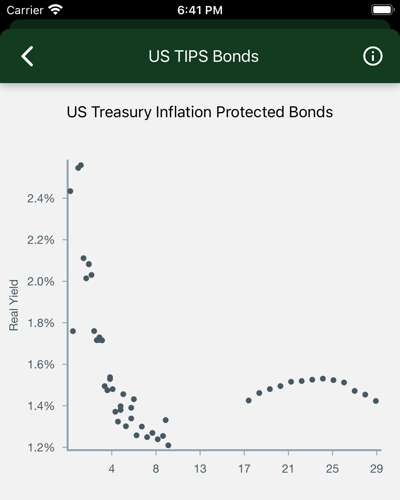
One dot represents an outstanding TIPS bond that matures in a given term. A line (yield curve) is fitted to the real inflation adjusted yield of each issue.
-
Maturity appears on the x-axis. This is the years to maturity of the bond.
-
Real Yield appears on the y-axis. The inflation-protected yield. If the real yield is shown as 1.0% and inflation is 2%, compare to a
bank account paying 3% on savings.
Discussion
It is possible to build a completely (with the exception of Treasury default) hedged portfolio consisting solely of TIPS bonds. This comes at
great cost though, as you would give up any stock market returns, which have historically outpaced these securities. Where TIPS bonds come
into their own though, is as the foundation of a hedged portfolio. By mixing TIPS bonds and stock market instruments, you can create a portfolio
that provides a yield, commensurate with your risk tolerance, between that of market returns and the solid floor provided by the TIPS bond.
6 - Hedge with a TIPS/S&P Mix
For a given maturity, vary the proportion of S&P and TIPS holdings to achieve desired risk/return.
Suppose you are plotting an investment to mature in ten years. How do you structure it to keep your risk constant, even though future expected S&P returns will vary from year to year? Vary the proportion of S&P and TIPS holdings.
Data
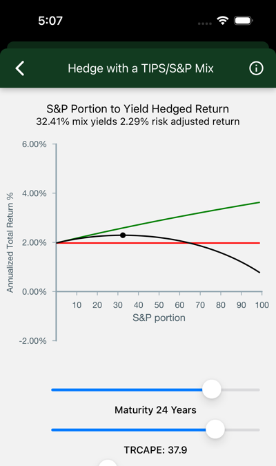
The chart shows expected annualized total after-inflation return of a fixed-term S&P/TIPS mix, with S&P content ranging from 0 to 100%.
Use the sliders to see the effect of changes in starting assumptions: term, aversity, and TR CAPE.
-
Annualized Total Return % appears on the y-axis. This is the expected annualized total after-inflation return of an S&P/TIPS mix.
-
S&P Portion appears on the x-axis. This is the percentage of an S&P/TIPS mix which is placed in the S&P, with the remainder in TIPS bonds.
-
Expected S&P return is shown by the top (green) line. It tops out at the expected return of a 100% S&P portfolio.
-
TIPS yield is the horizontal (red) line. It shows the return on a TIPS investment with the selected maturity.
-
Risk Adjusted Return This line (black) charts the risk adjusted return for mixtures of between 0 and 100%. The dot marks its maximum.
-
Maturity is the term of your hybrid investment.
-
Aversity 1 is the default. A value of .5 has the effect of hedging against loss rather than achieving the maximum risk adjusted return. Numbers higher than 1 will increase the cash contribution.
-
TRCAPE will have an effect on these predictions.
Interpretation
- The S&P portion rises as maturity lengthens.
- Short-term S&P volatility dominates. If you want your money back in a year you will not put it in the market.
- Long-term, it is very unlikely that the S&P will not beat TIPS. The lines never cross. A 100% allocation is called for.
- Trade increased returns for higher risk using the aversity slider.
- Even at large values for aversity you are going to include S%P in your portfolio as maturities lengthen.
- Current valuations, measured by TR CAPE, have historically had a noticeable effect on performance, and hence, on these predictions.
See this effect by trying high and low TR CAPE values.
Using this tool you can essentially design a custom instrument that pays off after a fixed term, with risk and return balanced to your
preference. Buy it and hold it long, without attending to daily ups and downs in the market.
Background
The data displayed on this page is modeled based on data sourced from U.S. Stock Markets 1871-Present and CAPE Ratio.
7 - Combine Yearly Instruments
Hedge your retirement with individual yearly hedged portfolios.
How do I design a portfolio that covers the length of my retirement?
We have seen (on the previous page) how to construct a combination of S&P and TIPS bonds that yield (with allowance for risk aversity) an optimum inflation-adjusted payout for a single fixed term. Now, the only remaining job is to construct such an instrument for each year of our retirement, and combine them in a single portfolio.
Data
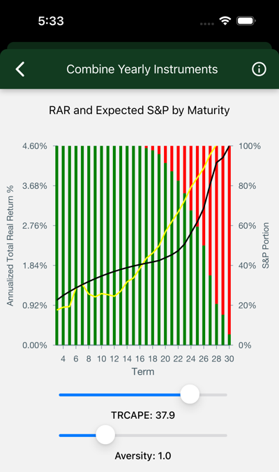
The chart shows expected annualized total after-inflation return of a fixed-term S&P/TIPS mix, with S&P content ranging from 0 to 100%.
Use the sliders to see the effect of changes in starting assumptions: aversity, and TRCAPE.
-
Annualized Total Real Return appears on the left y-axis. Use it to find values for the two lines on the chart. The black line is the risk-adjusted return. The yellow line shows the expected risky (S&P) return.
-
Tips Portion marks the right-side y-axis. Use it to guage the height of the left (green) bars, which tell you what percentage of TIPS goes into
each year’s payment.
-
Term is listed on the x-axis. See the yearly portfolio composition for each year, as well as its resulting return.
-
TRCAPE will have an effect on these predictions. Higher values result in more TIPS.
-
Aversity 1.0 is the default.
Interpretation
For each year, the bars show the portion of draws that come from market assets, on the top, and inflation-adjusted bonds, on the bottom. For out-years,
your portfolio will approach 100% stock.
- The aversity slider changes the composition of your portfolio, as well as the gains for early years.
- Move it right to increase the cash holdings, left to decrease.
- TRCAPE can be adjusted to see how the portfolio would be adjusted for different current market valuations.
With this design, you have determined the source of your yearly draw.
The next step is to add your yearly expenses and assets, then optimize draws by account to secure the most tax-advantaged result. Your final result: Your Hedgematic portfolio.
